Saturday 31 March 2018

Development of Website

Tour Page

Today I decided to develop the 'Tour' page of my website in particular as before I hadn't edited the button to show specific dates and times regarding the artist's various performances, so I did that making sure that I included a wide range of venues (That I had researched) and changing the information regarding the times and price. 


Shop Page

Initially, I had designed clothing merchandise as a way of promoting my artist, this included t-shirts, joggers, hats etc. Towards the end of production, I had realised that I hadn't put the song and album onto the shop page - this was significant as it was the main product being advertised on the front page of the website. Following conventions of real media products, I developed this page by providing the option to buy both the album in both MP3 and CD format and the single in MP3 format. 


About Me Page

Initially the 'About Me' page had lots of information regarding the artist but no images of him. I decided that this could seem quite boring to an audience or viewer and decided to include a rather large picture of him that be seen as soon as you click onto the page in an attempt to establish a brand image. 


Sunday 25 March 2018

Development of Digipak

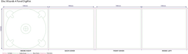
Before starting the production of my digipak I decided to use this template as a rough guideline of where exactly to position everything such as my images, text etc. 


On the left are the photos I am going to use for the front cover of my digipak (uneditied):I decided to do the front cover first as it was the most important and once I'd done this I could make the others relating them directly to the front cover. So for the front cover I decided that I wanted to use the same photos of my artist that are featured on my website to ensure that I had synergy between the two and to establish the 'star image' - if I have an image or images of my artist on the front cover of the digipak it will be recognisable to the audience. Before actually placing in over the template I decided to edit the photos in Photoshop.


The first thing I did was position the images over each other to get the effect that I wanted with the second image somewhat enlarged in relation to the first photo. I did this by changing the opacity of both images making sure that you could still see both images in enough detail. Whilst editing the photos for the front cover I experimented with saturation and colour grading as I liked the look of it. I also manipulated the images using shapes specifically squares and rectangles and I did this by using the select tool to select a rectangular or square of the photo and deleting it. As it had the other photo underneath, this gave a really nice and unique effect.  This is the picture I initially was planning to use for the front cover of the digipak after editing it in Photoshop:


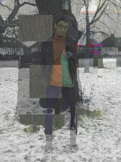
As you can see there were some issues with the color grading particularly around the bus in the background that I didn't like and I was finding it difficult to get rid of this. This was when I decided to make the whole image in black and white - by doing this I was avoiding the problem of the colour grading but also making a direct link between my digipak, website and music video as the music video has black and white flashbacks in it. I did this by using a black and white overlay. 

After deciding that I was happy with the image I decided to flatten it and save it as a JPEG to use on my digipak and place over the template. Once I'd imported it into Photoshop, I had to crop the image so it fit inside the space for the front cover. I did this by first positioning the photo where I wanted it within the square and then selecting anything outside the square and deleting it. 


 Obviously the front cover wouldn't be complete with just an image as this wouldn't follow the conventions of an R&B digipak. I added the album title 'WORLD//WHY' and the artist logo to make the digipak more recognisable - if the audience were familiar with the logo it would probably be the first thing they'd notice on the digipak. 

As you can see on the left, my front cover consisted of 3 layers, the main image that I'd already edited in Photoshop, the album title and the artist logo. 

Final Front Cover for the Digipak: 


Back Cover

By the time I'd gotten to my back cover, I'd decided that I would make the whole digipak black and white because just having the front cover black and white would look confusing in comparison to the other sides of the digipak. I decided to use a concert image for the back cover so to make this black and white I did the same thing (using a black and white overlay) as I did for the front cover. I decided to add a texture behind the image to make it more unique and it was in fact a texture that showed what looked like crumpled paper which looked like it had been burnt. I chose to use this texture in particular as it provided a strong link with the music video - specifically the shot at the beginning of the photo being shown next to the lighter. On the back cover I also used the text tool to create the song names, album title and legal information; ensuring that they were all in the same font. I also put the production logo on the back cover and a barcode - following the conventions of a real media products. Final Back Cover for the Digipak: 


Inside Left and Inside Right

I'd already edited both the front cover and the back cover, I wanted to keep the inside left and right as quite simple. For the inside left, I decided to use the same image evident on my front cover but with less manipulation. Rather than manipulating the image, I used another texture/image that I sourced of a geometric shape pattern. I decided to use this as it provided a strong link between my digipak and my website it places emphasis on the use of shapes. As for the inside right, I used a picture of my artist walking away with no actual editing aside from the black and white overlay with the same crumpled paper texture I used behind the concert image on my back cover. Obviously as well as this I created the circle in the middle to establish that this was the side of the digipak that would have the CD in it. 

Friday 16 March 2018

Production Diary - 3,4 and 5


Day 3 - Today was a successful day - we started filming at around 11:30am and with the help of our friend Sara, managed to film the bits of Allanah travelling home. We planned to film the park bits today but we didn't have enough time so the footage of Allanah travelling home is all we got but it was really good quality and exactly how we wanted it to look. Today we also managed to film Allanah's shower scene which is going to go at the beginning. The corresponding footage Becky will film in her own time as we don't all need to be there. Both of these scenes will be filmed on the GoPro.

Day 4 - With the deadline for the rough cut soon approaching we wanted to get most of the remaining footage filmed today, specifically all of the park scenes so we wouldn't have to go back. This day we managed to film a lot -  all of the park scenes and even a lot of footage of Allanah and Becky travelling to the park. We also managed to film the footage that was needed after the scenes of Becky's dad shouting at her - this included her going upstairs to her room, crying on the bed, and finding the picture on the floor after throwing her books on the floor. This was a really productive day and we think we'll need to film one more time but then we should be finished. Ideally we would have wanted to shoot all the footage before editing but because of various technical problems we have had to deal with we have been editing the footage that we have as we go along. With the majority of the footage now filmed we hope to get together a decent rough cut. 

Day 5 - This was hopefully out last day of filming. After all staying after school to edit we left school at around 3:30 and went straight to Allanah's to film the remaning footage which was the scenes of her greeting her mum and then finding the picture. This was another productive day, although it was fun we hope to be finished filming now and moving our focus to editing in order to get the music video finished before the deadline. 

Thursday 15 March 2018

Production of Logos

I decided to use Adobe Illustrator to make both my artist logo and production company logo as it was a piece of software I was already familiar with and confident in using. 

Artist Logo

For my artist logo I decided to sketch 4 rough ideas so I could get some feedback from my target audience and then choose from a range of ideas. My initial rough sketches are below:

After gathering feedback from my target audience on all four of my artist logos, I decided I would stick with my first idea because it got the most positive feedback and was the one that I liked the most. 

Making my artist logo using Adobe Illustrator:

1. Similarly to my production logo, all of these designs comprised of basic text and the crown visual meaning that it was easy to create. So firstly I used the text tool to create the separate words and then placed them in the arrangement. It was important for me to pick a font that fit my genre.

2. I used the line tool and oval tool to make the crown visual and then put it over the 'T'.

3. I also decreased the size of the crown visual and placed it onto the edge of the last 'E' of 'THRONE' so it looked like it was hanging off the actual letter.

My Final Artist Logo:


Production company logo

As I did with the artist logo, I came up with 4 production company logos before deciding which one to take forward and make in Adobe Illustrator. My initial rough sketches are below:


I decided to use and produce my second idea because I thought one of the designs with the rectangle shapes (2 or 3) would be the most suitable for putting on my digipak and possibly my website. Between the two I liked the second design more because it thought I needed to have the word 'productions' within the logo otherwise it would people may not know what HEIR means or that it is even the production logo. 

Making the production logo in Adobe Illustrator:

1. As my logo design was made up of text and shapes it was relatively easy to produce in Illustrator. But the first thing I did was create the rectangle outline using the shape tool. 

2. Secondly I used the text tool to write the production name and then I just placed this where I wanted it inside of the box. 

3. Lastly I used the line tool to make the crown, making sure to zoom in and make sure that the crown looked neat with no lines poking out. After I was happy with the appearance of it, I simply decreased the size and placed it above both of the 'i'''s of the text. With a simple line underneath the word production which I made thicker.

My Final Production Logo:


Wednesday 14 March 2018

Screenshots of Editing Process/Editing Diary 1

Now we have all of our footage we are able to start the editing process. Today we started importing the footage we had for the beginning of the music video specifically the shot of the lightbulbs with the production logo first which would be followed by the bath/shower shots to establish the characters early on.

Today we also put in footage of the empty bench - the importance of  which will be understood later on in the video. During this editing session we also used a range of transitions to ensure that the footage ran smoothly with good match on action and no continuity issues. By the end of this session we had a solid beginning to the music video which continued until the first flashback. In this session we also did our first bit of colour grading on all of the footage we had edited. We were also able to make the title for the split screen and alter the thickness. Having done this already will save us time in other editing sessions as all we have to do it insert the title over the footage. 


Monday 5 March 2018

Rough-Cut Feedback

In class, we all presented a rough cut of our music videos. At the time, a lot of our footage needed to be re-filmed so we didn't bother putting this into the rough cut for two reasons; 1. We weren't happy with the quality of the footage and had bits missing and 2. We were running out of time to edit. Based on these decisions we decided to use the time wisely to ensure that what we did have which was the beginning of the music video, was good quality and looked how we wanted it. Therefore, our rough cut was very short in length but what we did establish through the beginning was the feel of the music video so the class could imagine how the video will look like when we are finished. Here was the feedback that we got:


 Here's what the other groups liked about our Rough-Cut:

- Liked the colour grading
- The footage was well edited
- Good use of GoPro
- Good continuity 
- Excellent concept
- Good range of camera angles
- Good lighting
- Use of split screen
- Great acting 
- The originality of the logo

Here are the suggested things that we could improve on:
- Add more footage
- Glow effects to give it a more surreal dreaming feel
- Issue with the placement of the footage - swapping sides at the beginning
What we need to do now:
- We need to get a move on with the overall production of the music video, specially re-filming the footage that we need to and putting this footage into the sequence so it is ready to be edited.
- Make sure there are no further continuity issues and issues with placement of the footage - need to make sure that our actors are on the same side of the screen throughout the whole video
Conclusion
This Rough-Cut feedback session was very helpful in terms of giving us things to work on. We hope to take this feedback and use it to improve the sequence we already have and finish the music video.

Friday 2 March 2018

Production Diary - Day 1 and 2


Day 1 - Today was our first time going out to film and we decided to film the scenes of Becky travelling home. We wasted some time working out how to use the camera as we hadn't use this specific type before but after we figured it out we managed to get some really good footage. In particular we got some really good shots of Becky on the bus (both medium close ups and close ups) to show her emotions. We also managed to get good footage specifically of Becky opening her gate and going into her house. Today we tried to film some additional shots from the inside of the house rather than the outside but the lighting was quite dark and we decided that the footage didn't look of a good enough quality to use in the video so we decided to leave it at the bit where the front door closes (from the outside). Even though we didn't film a lot today, the footage that we did manage to get was of really good quality, shows various different camera angles and looked exactly the way we wanted it to (bearing in mind that it would be in slow motion with the corresponding footage of Allanah on the other side). 


Day 2 - This day started off well because we all finished early and we had all of the equipment ready. However, when we got to the park and attempted to film most of the park scenes, the camera would stop recording half way through the shot and showing a 'Card Full' error. We tried to solve the problem by deleting the footage that we didn't need but even then there still wasn't enough space and we'd only filmed a few shots. This was a big problem because after travelling all the way to the park with the equipment we weren't able to film as much as we would have liked to. As a result, this wasn't a very successful day. We managed to get some great shots but because we could only film bits of it, we decided not to use this footage to prevent inconsistencies in Allanah and Becky's costumes. Although this day wasn't very successful, we did get some great close ups which we are planning to include at the beginning of the music video. Even though they are wearing different clothes we are still going to use these close ups as we figured that their clothes won't be in the shot.

Candidate Information

Candidate Name: Abigail Baxter Candidate Number: 4129 Centre Number: 14405 Brief: A promotional package for the release of an album, to ...